 Home
HomeOverview
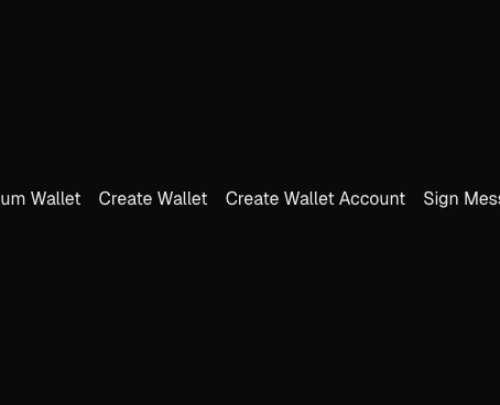
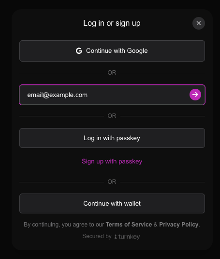
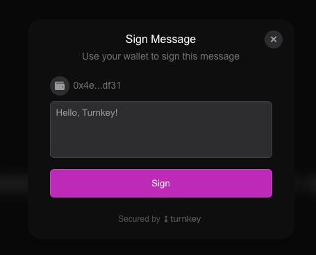
The Embedded Wallet Kit provides a set of customizable UI components that you can use to enhance the user experience in your React application. These components open up in a popup modal and can be customized to match your application’s design. The UI components show up automatically when you call certain"handle" functions from the useTurnkey hook, such as handleLogin, handleSignMessage, or handleImport. These functions will open a modal with the appropriate UI for the action.
All styles are provided in the @turnkey/react-wallet-kit/styles.css file. You must import this file in your main application file (e.g., app/layout.tsx in Next.js) to ensure the styles are applied correctly.
For Tailwind CSS V3 users:Please refer to the Tailwind V3 error in the troubleshooting section for specific instructions on how to import the styles correctly.You can continue with the guide as normal if you are using Tailwind CSS V4 or not using Tailwind CSS at all.
Customizing the UI components
You can customize the look and feel of the modals by configuring theui object in the TurnkeyProvider’s config. This allows you to toggle light or dark mode, set custom colors, and more. You can see the full list of available options in the SDK Reference or by inspecting the TurnkeyProviderConfig interface.
Fonts
Turnkey’s modals are rendered inside thebody element of your application by default. That means that any fonts that are applied to the body will also be applied to the modals. You can use any font you like, including custom fonts, by applying them to the body element in your CSS.
Rendering modals elsewhere
You can force the modals to render as a child to theTurnkeyProvider by setting the renderModalInProvider attribute to true in the TurnkeyProvider’s config. This is useful if you want to render the modals in a specific part of your application, such as a dedicated modal container. This may cause the modals to be distorted in certain cases, so use this option with caution.
Making your own modals
You can also use theuseModal hook to manually push and pop modals, close modals, or listen to the modal stack. This allows you to manually control the modal experience or create custom modals that fit your application’s design. Your modals can have multiple pages, and you can navigate between them using the pushPage and popPage functions.
TurnkeyProvider. Transition effects and a title bar with controls (like close and back buttons) will also be automatically applied.
Here’s how it will look: