> ## Documentation Index
> Fetch the complete documentation index at: https://docs.turnkey.com/llms.txt
> Use this file to discover all available pages before exploring further.
# Embedded wallets quickstart
> Three paths to get started with Turnkey's embedded wallets, whether you want to explore, clone, or build from scratch.
export const FeatureCard = ({title, description, icon, logo, href}) => {
return
{logo ?  : }
: }
{title}
{description &&
{description}
}
;
};
Turnkey's embedded wallets let you add secure, fully-featured wallet experiences to your app. There
are three ways to get started, depending on how hands-on you want to be.
**Building with AI?** Connect your IDE or LLM to Turnkey's docs via our [MCP server and LLM
feeds](/get-started/using-llms) for contextual help while you integrate.
***
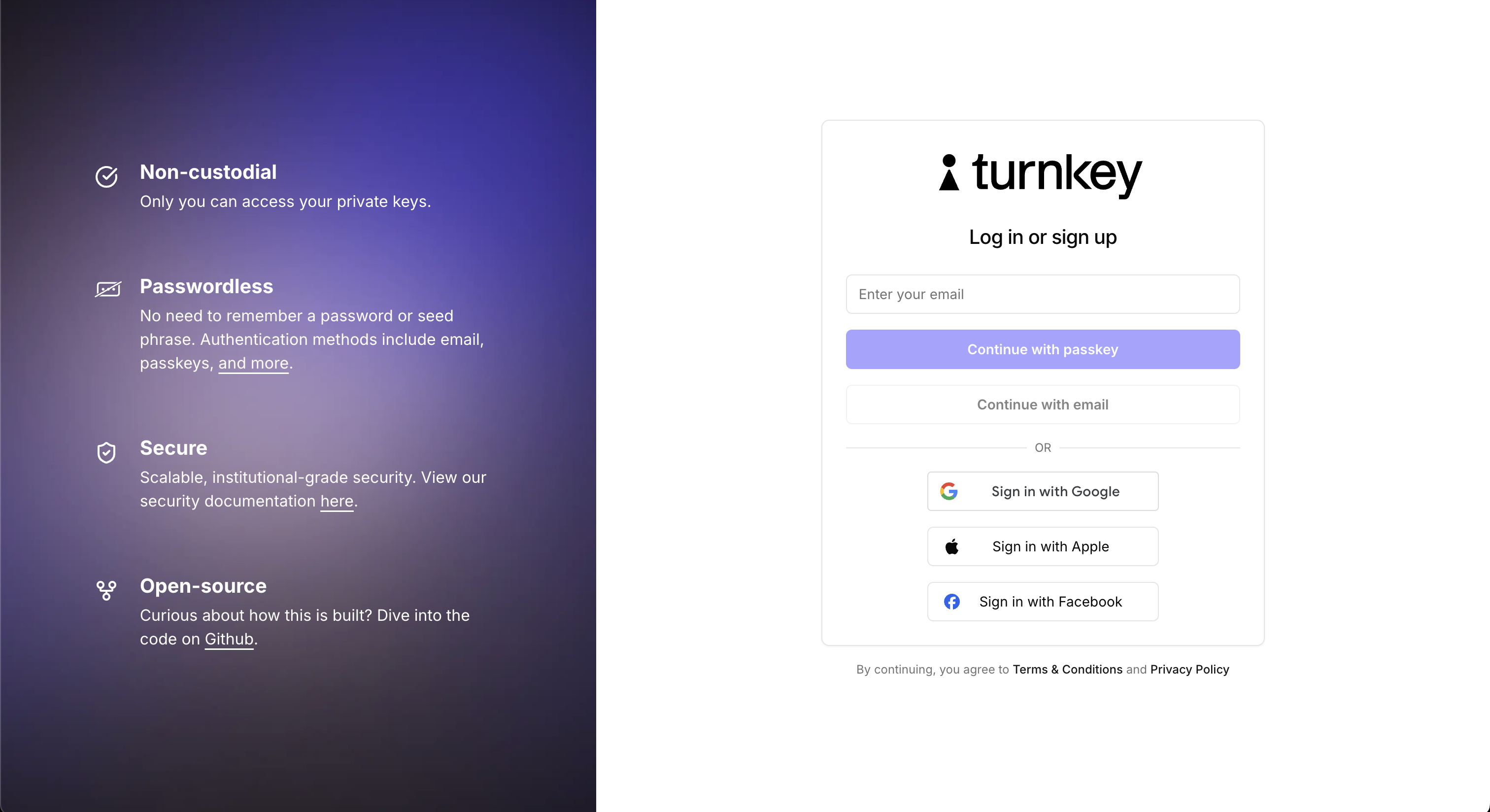
## Explore the live demo
The fastest way to see Turnkey embedded wallets in action. Our
[live demo app](https://wallets.turnkey.com/) is a fully functional embedded wallet built with the
Wallet Kit. Use it to try out authentication flows, wallet creation, transaction signing, and more,
all from your browser with no setup.
## Clone and customize
If you want to get running locally, clone one of the demo apps below and start customizing. Each is
a complete, runnable application you can use as a starting point for your own integration.
### Web
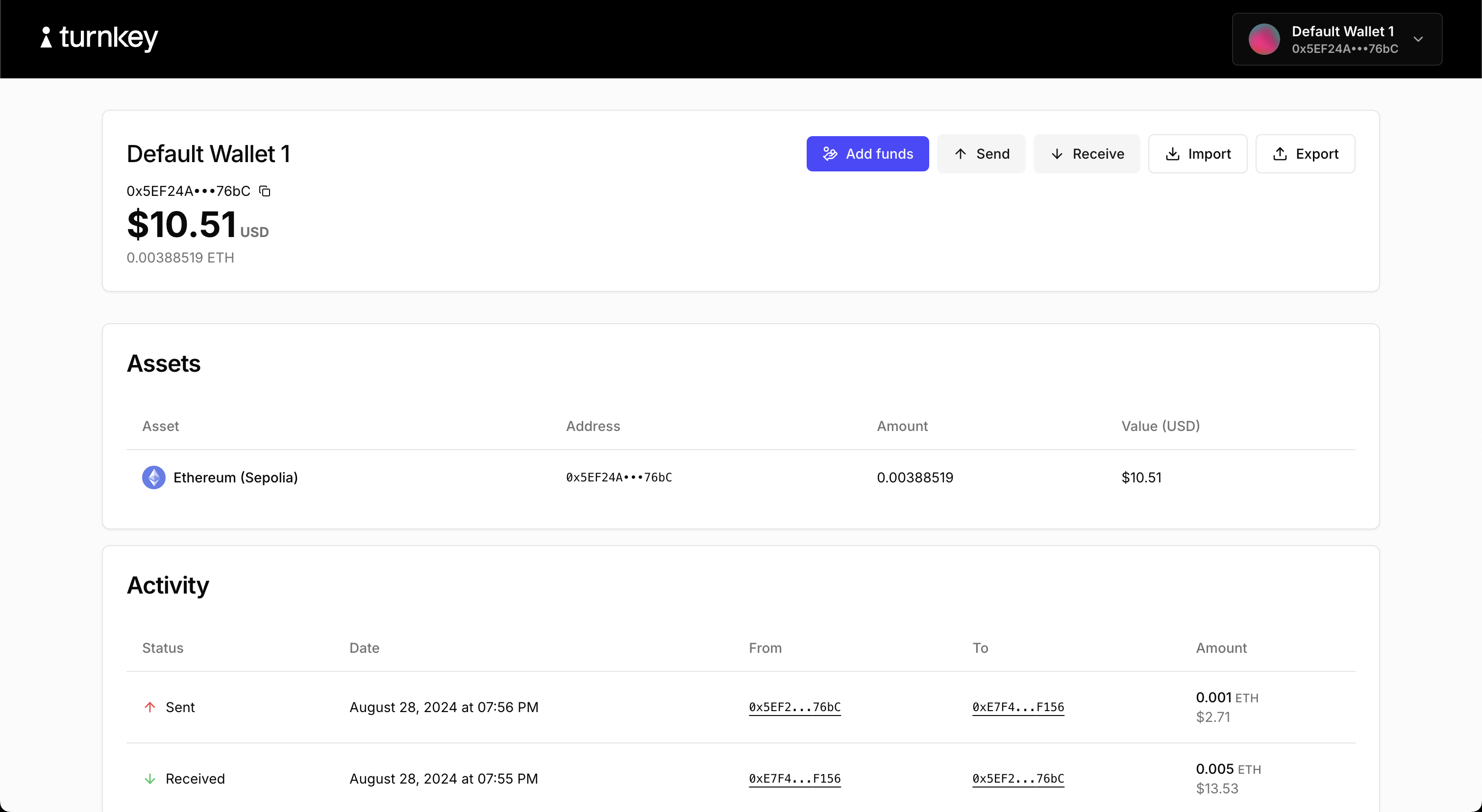
#### Demo embedded wallet ([code](https://github.com/tkhq/sdk/tree/main/examples/demos/with-react-wallet-kit))
The flagship embedded wallet demo. Built with `@turnkey/react-wallet-kit`. Covers the full embedded
wallet lifecycle:
* Authentication via passkeys, email OTP, and OAuth
* Creating wallets and wallet accounts
* Sending and receiving funds
* Importing and exporting wallets
* Adding credentials
 ### Mobile
#### React Native demo ([code](https://github.com/tkhq/react-native-demo-wallet))
Demonstrates Turnkey's JavaScript packages in a React Native environment. Covers authentication,
wallet creation, export, and transaction signing.
#### Flutter demo ([code](https://github.com/tkhq/dart-sdk/tree/main/examples/flutter-demo-app))
Demonstrates Turnkey's Flutter packages. Covers authentication, wallet creation, export, and
transaction signing.
## Build with the integration guide
Ready to integrate Turnkey into your own app? The
[Integration Guide](/solutions/embedded-wallets/integration-guide/overview) walks you through everything step
by step.
For React apps, the **Wallet Kit** is the recommended starting point. It provides pre-built auth and
wallet UI components, a hook-based API, and requires no backend setup.
For React Native, Flutter, Swift, or Kotlin, choose the guide for your platform:
Pre-built components with minimal configuration.
JavaScript packages for React Native.
Dart SDK for Flutter apps.
Native iOS integration.
Native Android integration.
For fully custom implementations or lower-level control, you can work directly with the
[Turnkey API](/api-reference/overview/intro).
### Mobile
#### React Native demo ([code](https://github.com/tkhq/react-native-demo-wallet))
Demonstrates Turnkey's JavaScript packages in a React Native environment. Covers authentication,
wallet creation, export, and transaction signing.
#### Flutter demo ([code](https://github.com/tkhq/dart-sdk/tree/main/examples/flutter-demo-app))
Demonstrates Turnkey's Flutter packages. Covers authentication, wallet creation, export, and
transaction signing.
## Build with the integration guide
Ready to integrate Turnkey into your own app? The
[Integration Guide](/solutions/embedded-wallets/integration-guide/overview) walks you through everything step
by step.
For React apps, the **Wallet Kit** is the recommended starting point. It provides pre-built auth and
wallet UI components, a hook-based API, and requires no backend setup.
For React Native, Flutter, Swift, or Kotlin, choose the guide for your platform:
Pre-built components with minimal configuration.
JavaScript packages for React Native.
Dart SDK for Flutter apps.
Native iOS integration.
Native Android integration.
For fully custom implementations or lower-level control, you can work directly with the
[Turnkey API](/api-reference/overview/intro).